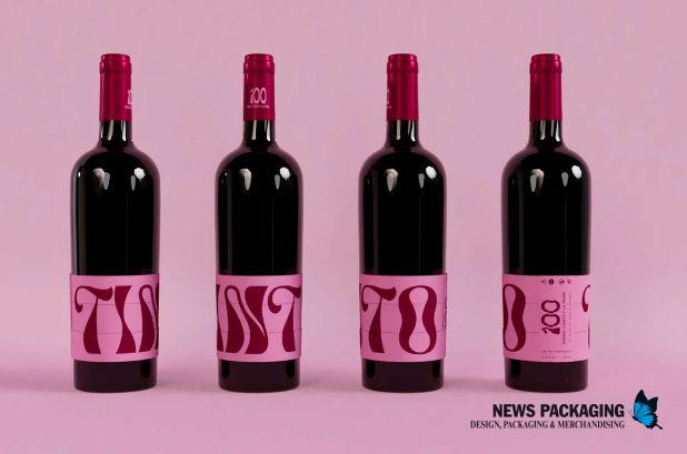
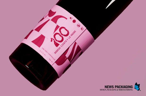
The packaging for the five new products from the family-run winery Ciento y La Madre in Logroño is aimed at Generation Z. This comprehensive design, created by Laura Ramos and Lourdes Suárez , features five primary containers for bottling red wine, white wine, sparkling wine, pacharán (a sloe-flavored liqueur), and beer.
The entire labeling system is cylindrical, consisting of three rings that rotate around the bottle and are held in place by loops. The label is divided into three rotating parts, allowing the user to play a game until they find the correct word on each bottle.
The graphic design , featuring a striking, high-luminosity color palette, is based on typography: each bottle contains a word that defines the product and is arranged around the entire label: Red, White, Sparkling, Pacharán, and Beer.
A dynamic, uppercase typeface was used . All the words mentioned were composed using the Aveneur font. This typeface is characterized by its strong nuances, thanks to its undulating lines, which represent the dynamism and movement of wine.
In terms of layout, the words are aligned within a rectangular box. The grid is divided into three horizontal stripes, dividing the text into three parts so they can rotate around each other, creating a user experience.
For the red wine, a truncated conical Bordeaux bottle was used ; for the white wine and the pacharán, a Bordeaux bottle; for the sparkling wine, a cava bottle; and for the beer, a beer bottle. Therefore, the structural concept is based on the shape of a cylinder.