“We put the focus on making our designs a success in sales for the client”
Delamata is an independent branding and packaging studio located in Madrid, with more than 15 years of experience working for big brands. Its CEO explains its history, its projects and its vision of packaging.
Why did you decide to specialize in branding and packaging design?
Design has always been the passion of our founder and executive creative director Teresa Martín de la Mata. She studied Fine Arts at the Complutense University of Madrid and completed her training in marketing and business strategy by doing several master's degrees at the Instituto de Empresa and IESE in Madrid.
Her professional experience of several years in London at a design agency specializing in spirits packaging, Blackburn's, and in Paris at Remy Cointreau, in charge of developing new projects, allowed her to learn the working methodology and receive the influence aesthetics of these two inspiring cities. In 2003 he founded Delamata and specializes in branding and packaging design. We currently offer other services to our clients such as the creation of naming, design and point of sale strategy, research and structural design.
Can a packaging be decisive in the success or failure of a product?
Definitely yes, although it is not the only variable. Packaging is the most important element that brands have to be in contact with their consumers. It is an element that is present every day either on the shelf or in our homes. The consumer makes the final decision about which product to choose in just 7 seconds and that is the time he spends deciding whether to choose one brand or another. The pack must not only be attractive and innovative, but also convey the values of the brand to be the chosen one, compared to all its competition that shares linear, and must also connect emotionally with the consumer, and thus be memorable. The packaging should never reflect the product as an overpromise but as what it really is, in the most attractive and honest way possible.
In many of his designs, color plays an important role. Could it be said that they opt for color and flee from minimalism?
It obviously depends on the project. For a range of mainstream products, color is important for differentiating varieties or sub-ranges, and we use it as another tool. There are certain products, such as a soft drink, in which the use of color is very important to emphasize the 'fun' concept. Fashions are cyclical and minimalism is a design maxim that cannot be avoided in certain projects. If we are designing the packaging of a perhaps more premium product in which naturalness and simplicity help us to explain it better, we will always tend to make the design more minimalist, cleaner. In addition, this type of design fits perfectly to the reduction of materials necessary in the search for sustainability that is valued today.
What importance do you attach to illustration?
As in the previous point, it depends on the project. We are passionate about the world of illustration, but we cannot let our tastes or passions come before the needs of the project itself. In the end, illustration is one more resource, such as typography, colors, photography... And, as with each of them, first of all, it is necessary to analyze and assess whether its use contributes to the design itself. In addition, there are various ways to use this resource, from the main illustration that acts as a recognizable element of a design, to the illustration that enriches a small stamp and is presented only as a detail.
How do they contribute to a more sustainable packaging?
Whenever we have the opportunity, we propose recycled or recyclable materials for both the packaging and the labels and inks to be used. We try to put our grain of sand from the beginning of the project. Today, brands are very aware of sustainability and of conveying to the consumer their concern and their commitment to caring for the environment. In this aspect we are closely aligned with the marketing departments of the brands that know perfectly well that they either get on the sustainability train or they will definitely stay on the platform. The trend is to create packaging with just what is necessary, optimizing processes, materials, content and logistics.
They work mainly for food and beverages. Are they sectors more receptive to change, to innovation?
We work for all types of clients and all sectors, although it is true that there are some that evolve faster than others, as is the case of food and beverages. They are sectors that move more by trends and are more sensitive to change. In the beverage sector, innovations are focused on new recipes, with less sugar for soft drinks, more craft and artisan recipes for beers and with protein contributions for milk and shakes. In food, innovations are linked to products for vegans, Km. 0 and healthy products following consumer demands. Brands are attentive to what consumers demand of them and, although innovation is expensive for companies, they put all their efforts into bringing out new products to satisfy their customers, although they do not always succeed. We are here to help our customers shape all these innovations so that they are profitable and the choice on the shelves. We bring to our designs a strategic vision and a 100% focus on the business.
Tell us about two of your projects.
On this occasion we will talk about two quite complete projects and of which we feel especially proud of the result. On the one hand, the redesign of the branding and packaging of the Jolca olive range and, on the other, the creation of the naming, branding and packaging design of the Amaretto MalaVita.
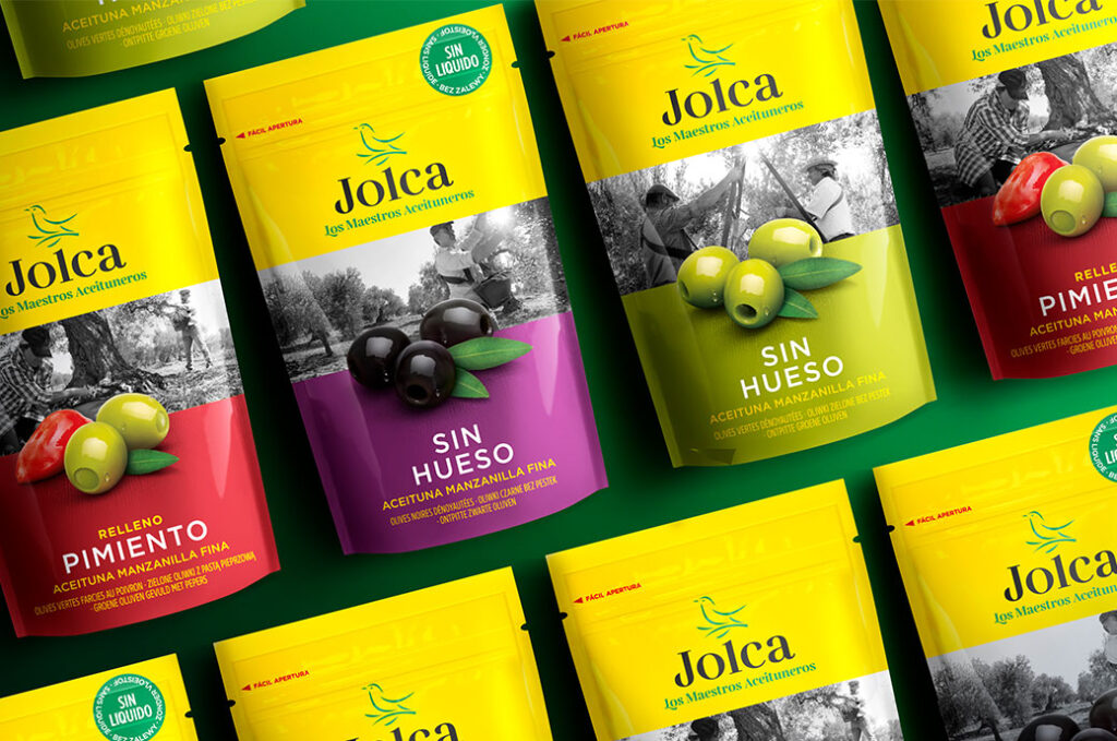
What was the goal with Jolca?
The goal was to modernize and create a new brand architecture. Create a new strategy that maintains the most authentic and positive values of Jolca. Define the distinctive and differentiating elements and organize the ranges depending on the different benefits for the consumer.
We wanted to connect the brand with new consumer trends, with a younger audience, and with diverse markets and consumers.
For this we did an exhaustive study of the competition and of the brand itself. We came to the conclusion of what values we consider most important for the Jolca brand. On the one hand we define the established values: craftsmanship, tradition / authenticity, quality, trust and origin. On the other hand, we define the values to be promoted: natural, flavor / variety, modernity / innovation and closeness / sociability.
We present a new logo full of character and uniqueness that manages to differentiate Jolca's identity, made up of the starling symbol, the 'Jolca' logo and its claim 'The Olive Masters'.
Through the color green we wanted to reinforce the association with the countryside and nature and the continuity of the brand towards a new future. Product photography reinforces the brand's commitment to quality. It had to follow established guidelines so that the product was presented in a natural, appetizing way and in a different way from the competition. We use a modern typeface with strong traits of tradition and craftsmanship.
In terms of appeal: 97% of consumers liked the new look.
How was the Malavita project?
It was one of the most complete we have done in the agency. We created the naming, branding, storytelling and packaging design for this amaretto from the Varma group. The objective was to create a naming for an amaretto with a young target, who likes to combine this drink with mixers for the "afternoon". The target of amaretto is traditionally very old and the brand sought to reach a young audience.
The name should lead us to an Italian product with a rogue character but with a lot of style. Mala Vita was the chosen name and at Delamata we took care of developing all the storytelling of the brand. When developing the branding we proposed several very different design routes. This is something usual in our agency. We like to propose different ways of design to offer the brand a range of possibilities from which to choose. Many times we help them to open their eyes in a certain way so that they realize how far their brand can go. Both the name and the branding are super powerful. Regarding the descent to the packaging, on this occasion we were very limited to the printing area of the bottle. The label could not exceed this measurement but despite this limitation, we managed both with the design and with the different finishes that we gave it, stamping in a metallic color for the Italian flag, embossed varnishes, etc., to give it the appearance and character that we wanted to label.
What do the awards mean? In addition to being a recognition, do they “open doors”?
The awards are recognition by design and marketing professionals of our work, but at Delamata we don't design with the goal of winning awards in mind. We put the focus on our designs being a success in sales for the client, we always think about the return on your investment. Nobody is bitter about a sweet and we present some pieces to the competition when we are clear that it is an impressive, innovative design or that it is out of the ordinary in its category. For us it is a double satisfaction to be awarded for our designs and at the same time to help our clients so that their products have repercussions in the media and achieve more visibility. On occasion, our executive creative director has also been a jury member for some awards such as the Cannes Lions, where she was part of the jury for the Spanish team in the design category. Prizes don't really open doors for us. What opens doors for us in order to get new clients is word of mouth from the brands we work with. Throughout these almost 20 years of activity we have earned the trust of leading brands at a national and international level. It really is our satisfied clients and our portfolio and experience that open the doors to new clients.
What trends do you currently observe in packaging design?
The style of branding and packaging is in line with the personality of the brands, but no one is exempt from the influence of the predominant graphic design patterns each year. Basically they are trends that change year after year. In this sense, we can talk about various trends that are being seen on the shelves, such as the use of lettering as the protagonist of the designs. We are not only talking about the values that each typeface can transmit (power, closeness, naturalness) but about pure aesthetics to attract the attention of consumers. Another current trend is minimalism on textured or raw materials. In this way, the simple, sober design with neutral colors is supported by the material to finish giving meaning to the design. Other trends that come and go are the retro style of the nineties. Any wink that inspires nineties nostalgia is a trend.