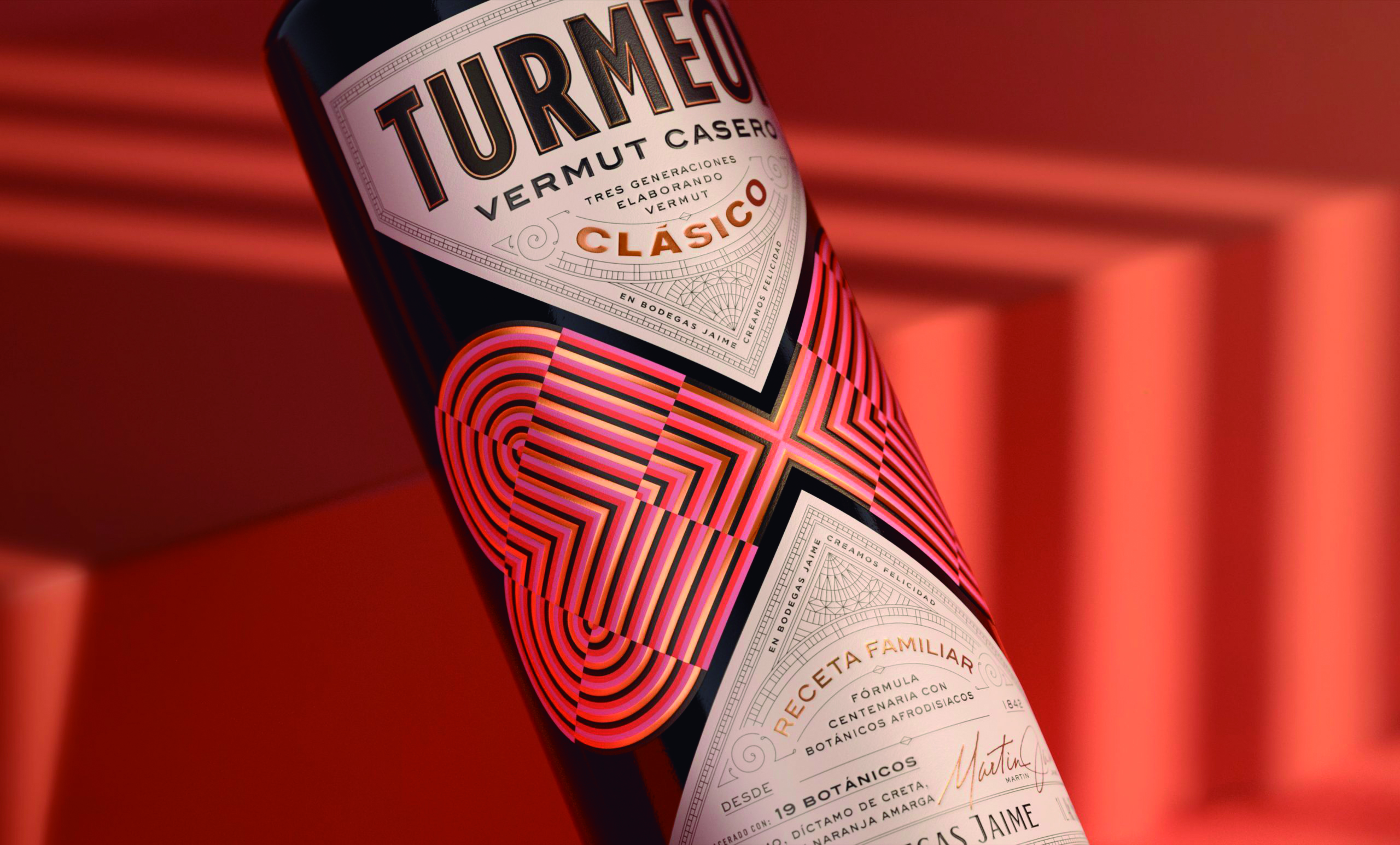
Pep Bernat Vizcaya and Ainhoa Nicolau Salas designed the packaging Turmeon vermouth (Jaime Wineries). The vintage color system, combined with an intricate typographic pairing, creates a design unexpected, work of Simile, that differentiates this premium brand from traditional bottles.
Color patterns, details and foils portray the fun side of the brand while conveying the quality of the product itself. The labels they combine a strong visual impact with a modern and artistic look to create a unique and distinctive product.
The range is made up of two vermouths, the Turmeon Classic and the Turmeon Zero, with the same botanical ingredients and the same flavor as the Turmeon Classic, but with zero sugar and half the calories.

