The yogurts They are one of the most consumed products in Spain. Gone is its "medicinal" use: long ago they left pharmacies and reign in supermarkets and food stores. The Glass jars The original ones were replaced by plastic containers, with glass being relegated to enriched yogurts, usually of higher price.
One of the most impactful changes was the move to rounded container what did he give Danone few years ago; Subsequently, it launched new varieties with a brand image that evoked its history and, recently, it has started a campaign coinciding with the centenary of its foundation in which it talks about the love of parents towards children (Danone was the nickname of Daniel, the son of Isaac Carasso, who was the one who began to make yogurt in a workshop in Barcelona).
The appearance of the doypacks, especially for the Horeca channel, because at the moment it does not have great acceptance among the general public. An example is Danone Pro, in a flexible doypack type container with a modular and precise opening. 
The emergence of lesser-known brands and private labels such as Hacendado de Mercadona, which clearly prevailed in the market, was a shock to traditional firms. We refer to La Fageda, Pastoret, Ametller Original, Comas Farm, Armengol, La Torre (with packaging designed by Puigdemont Rock) ... with a totally different branding, new flavors, own productions and an innovative image.
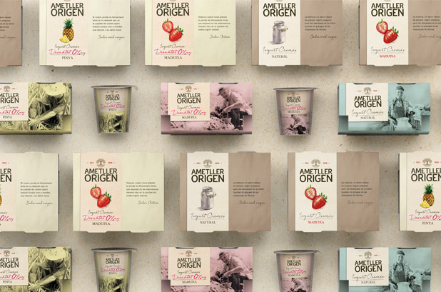
In the case of yogurts Ametller Origin, Little Buddha created an identity that transmits the real and close relationship of the Ametller family with the land and its commitment to offer the most natural products, from its production control, with a design grid that allows to identify the brand and ensure a strong graphic consistency, at the same time that each category and each product is differentiated.
Another example, Pastora the packaging designed by Side Branding. In the 125 g yogurts, plastic was abandoned to use a waxed cardboard tub, with a personalized decoration of each flavor through illustrations. For the Yoghurt Whims, a glass jar was chosen, which allows you to see the different layers of the product, with a little book attached around the small jar with a string. 
Traditionally, the glass tumbler had been associated with the most "premium" desserts and especially with The Milkmaid, a Nestlé brand, which, when it launched its yoghurts with jam, renewed its packaging but kept the glass container that characterizes it (who does not remember the advertisements in which the noise of the spoon against the empty glass?).
Finally, liquid yogurts deserve a separate chapter, whose boom is part of the growing trend of consumption of on-the-go products, in plastic bottles with integral design sleeves.
#maicapackaging

