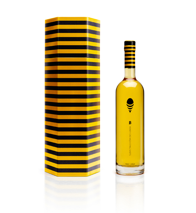
"B". The bottle has an elegant, bold and clearly minimalist design: “fun and luxury come together in the container that surrounds the honey-colored drink”.
All product information was moved to the sides of the bottle, in order to preserve the refraction of the glass. The packaging design is yellow and black, but the monochromatic bottle shows the amber color of the liquor; thus, bottle 'B' allows the golden liquid to guide the design. A simple black logo is reminiscent of both a bee and a drop of honey, and the initial "B" has an exaggerated stinger-shaped silkscreen.
In addition, the hexagonal box with yellow and black stripes can be used as a reusable isothermal cooler.
