Brasmar renews its image

August 23st, 2021

brash

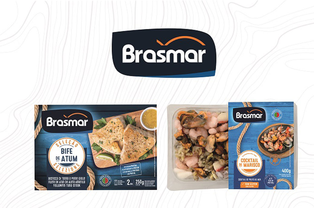
roar, leader in Portugal in the sector of seafood, he just launched his new packaging to the market for ranges brash y Brasmar Selection. With this update of the commercial image, brash aims to convey the essence and deep connection with the sea and the quality of its products, valuing the importance of responsible fishing for the brand. In the new visual identity of the ranges, the logo from Brasmar, allowing the brand to be more easily identified on the shelf.

With this rebranding, Brasmar also intends to offer a more up-to-date image, to improve the information transmitted to consumers in terms of the nutritional and healthy characteristics of the products, and to adapt to new market trends.

Brasmar and Brasmar Selección present differentiating elements that facilitate their identification on the shelf. The Brasmar range uses a sky blue wooden background in the packaging. The Selección range, aimed at products selected for their quality and origin, has a dark blue wooden background.

The packs of both ranges also recognizable and differentiating common elements that create visual links between them and reinforce the association with the sea; This is the case of the rope traditionally used in fishing activities that appears on all the brand's packaging.

At the same time, the identifying stamps of the different products were updated, allowing the consumer to differentiate the characteristics of each one. In the same creative line, the icons that show health and nutrition information are renewed.

You may be interested in continuing reading ...

Theyesbrand creates the packaging for Fresh Miles

Fresh Miles is a brand of the Bidfood group. Its core business is located in the B2B food sector, such as restaurants, communities, hospitals... The challenge for Theyesbrand was to renew the...

Vinarel·les, collection of signature wines

To create the new line of Vinarel·les signature wines, a very personal, identity-based and unique project, the Altavins winery turned to Bulldog Studio. Joan Arrufí, one of the great winegrowers of...

Luminous Design Group Seven Potions Grooming Products

London-based personal care brand Seven Potions enlisted design studio Luminous Design Group to develop a comprehensive visual language and packaging design that communicated the authenticity...

Calcoo signs the restyling of Finca Vegas wines

The vineyards of Finca Vegas are located between a 60 meter high stone cliff and a natural ravine. In this protected enclave of Las Vegas, in Tenerife, nature is as beautiful as ex...

An eco packaging signed by Habermas for Sal Dama Blanca

Dama Blanca is a brand from Cádiz. It is an organic sea salt from artisanal collection, which is born on the surface of the saline water due to the effect of the sun and the wind in the summer months. Be...

No Man's Space Eclipse Gin label by Spazio di Paolo, awarded with the Arconvert Label Award

No Man's Space Eclipse Gin by Spazio di Paolo is the winner of the Arconvert Label Award, one of the three special awards of the Dieline Awards assigned by Arconvert, official partner of these awards ...
Translate »