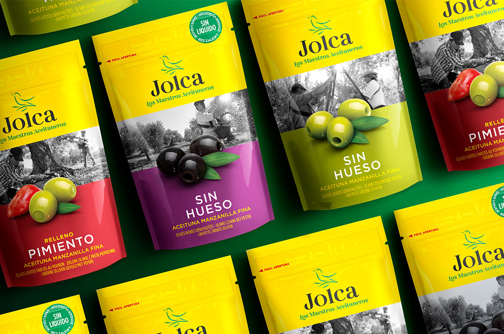
With the aim of modernizing and creating a new brand architecture, Delamata carried out a redesign branding and packaging from the range of Jolca olives.
Introduces a new logo full of character and uniqueness that makes Jolca's identity stand out, made up of the starling symbol, the 'Jolca' logo and its claim 'The Masters of Olives'.
Through the color green they wanted to reinforce the association with the countryside and nature and the continuity of the brand towards a new future. The photography of product reinforces the brand's commitment to quality. It had to follow established guidelines so that the product was presented in a natural, appetizing way and in a different way from the competition.
They used a typography modern with strong traits of tradition and craftsmanship.

