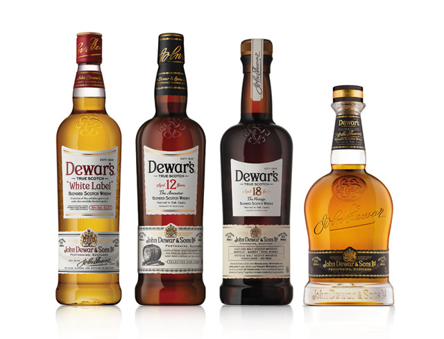
Dewar's Scotch Whiskey launches a new bottle and packaging design, supported by a global marketing campaign, "True Scotch Since 1846."
Dewar's new look begins with a different shape for each bottle in the range. The labels on the new Dewar's bottles incorporate special features to help consumers discover the stories behind Scotch whiskey.
The most distinctive feature of Dewar's new look is the cloverleaf-shaped Celtic knot that has been carved into the glass of each bottle. A powerful visual representation of Dewar's strength and longevity shows three interlocking letters “D”, representing the three important men who created the company - John Dewar and his sons, John Alexander Dewar and Tommy Dewar. The design is geared to embody Tommy Dewar's famous maxim that "product quality should be the best advertisement."
Dewar's new visual identity will launch this month in the UK, Spain and Greece, followed by the rest of the markets, including the US, Global Travel Retail, Russia, India and Lebanon.
