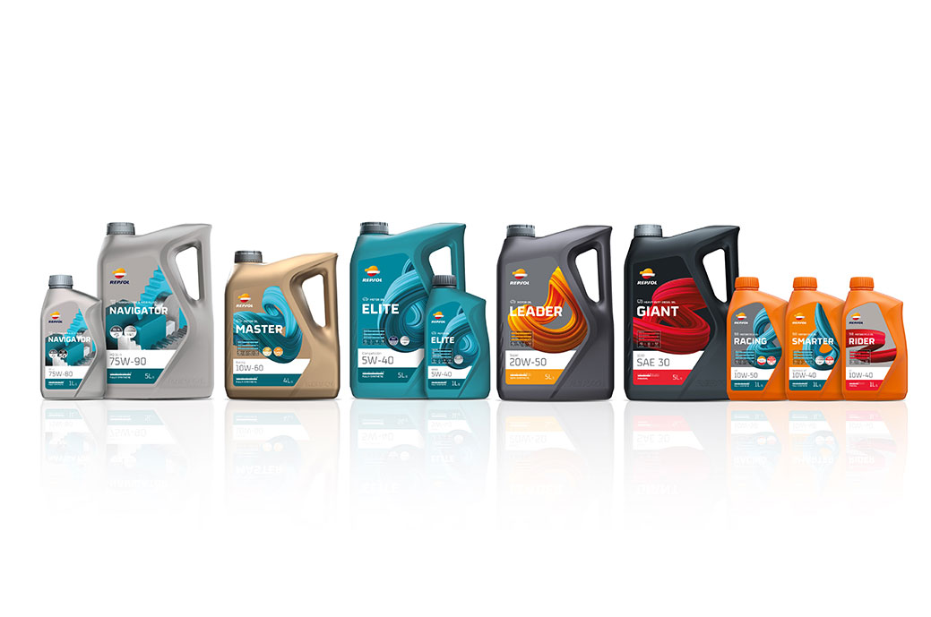
The brand consultant Interbrand has redesigned the range of lubricants the multi-energy company Repsol, which has redefined its portfolio is in order to simplify and unify it globally.
Repsol currently operates in nearly 100 countries, has 24 million customers and is present throughout the energy value chain with the ambition of leading the energy transition and being net zero emissions by 2050.
From Interbrand Madrid, the strategic concept "Reimagining the finest lubricants for your world" was developed, which would serve as the central axis for this project, developed around 3 areas of action: new nomenclature of ranges, new industrial packaging design and design of labels for all the products.
La Nomenclature, transversal to all ranges, seeks to appeal directly to the end user. This formula makes it possible to generate coherence between them, but to create differential names by product, with the final result being a customer-centric portfolio that breaks with the conventions of the category.
In containers, developed by bluemarlin, the Repsol logo itself and the world of competition inspire the shapes of the container, designed to save material in its manufacture, as well as to maximize space, simplifying distribution and storage. In addition, the iconicity of the container allows you to play with its color change to adapt it according to the vertical.
For label redesign, three-dimensional shapes would be the key to differentiation: knot-like shapes for the 3 main ranges (light vehicle, motorcycle and heavy vehicle), which reflect the innovation behind the product and are linked to the trails of the vehicles.
The design allows the label to act as a container for technical information about the product by showing it in a schematic and simple way through pictograms and bars. Likewise, the colors are adapted to the composition of the product, thus seeking to improve and simplify the consumer experience.
For the rest of the Repsol product ranges, a differentiating universe has been chosen that reflects innovation. For this, abstract compositions have been used that combine different objects and shapes in order to represent roads, waves, or industrial environments, valuing the technology behind the product at all times.

