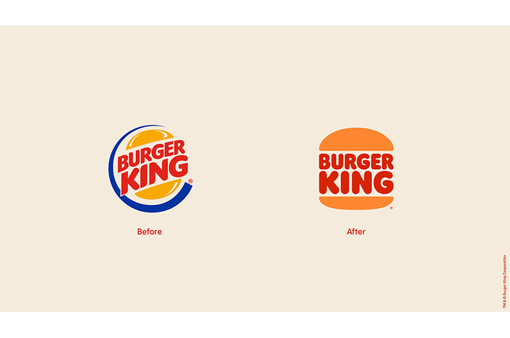
The North American Creative Agency Jones Knowles Ritchie (JKR) has redesigned the image of the products Burger King, an update that extends to the new look of the stores and the brightly colored uniforms.
Burger King wanted to update and focus on its benefits, such as natural ingredients and cooking on the grill. The new logo designed by JKR is inspired by the heritage of the brand and evokes the 70s, with a retro touch.
Bright ingredient illustrations dominate the the packaging, which stands out for the new Font patented «Flame», inspired by the shapes of its food. Large stripes of color characterize the new store designs. The round shapes of the illustrations are complemented by straight lines in the décor and architecture, which focuses less on in-store food and emphasizes take-out food more.
Dieline Award Best of Show 2021.