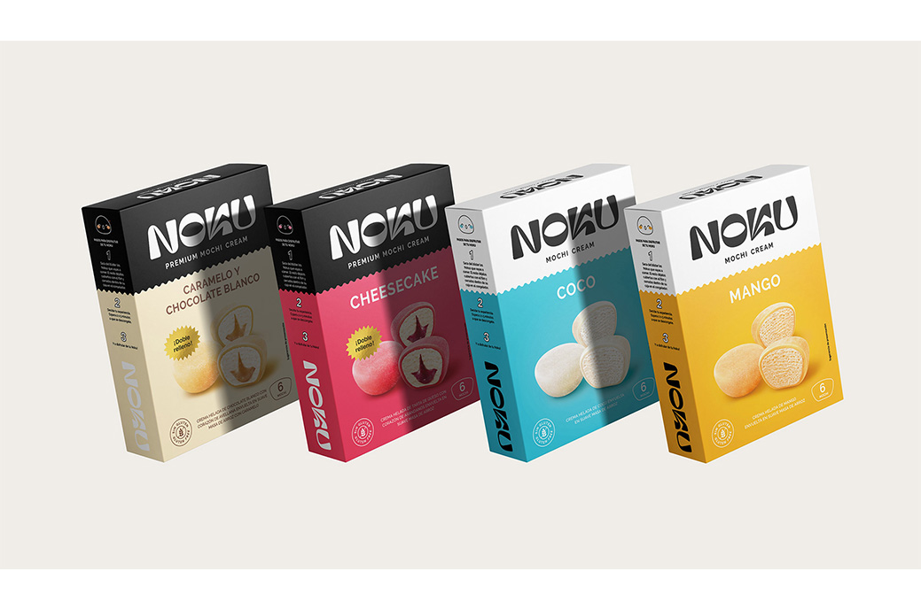
noku is a new brand for which since brandsummit developed the concept, naming, verbal identity, visual identity and packaging.
To do this, they took the Uchi-Soto social concept, which in Japanese is understood as "inside-outside" and is related to the duality of "public-private" or "group-individual" in the Japanese country.
Brandsummit searched for a name marked by its loudness and relevant tone, easy to read and remember: Noku.
El logo it is modern and at the same time traditional, tender as a mochi, but sharp as a katana, impressive and elegant. They created a logo following the uchi-soto concept, with shapes reminiscent of Japanese characters and a contrast between soft and sharp shapes.
Its diversity as a product is reflected in its commitment to vibrant colors, the contrast of its textures (cover and filling), its exotic origin and the explosion of flavor it leaves in the mouth.
In addition to the logo and the colors, a series of icons and illustrations were created to support the brand, both on the packaging and at the communication level.
For the packaging, they worked on the duality of the uchi-soto brand concept, dividing the container into two clearly differentiated areas, one in a single color with the brand as the main element, and another in full color, with renders of the product made ad-hoc for the brand and with the Color as the protagonist of the flavor to create differentiation on the shelf.

