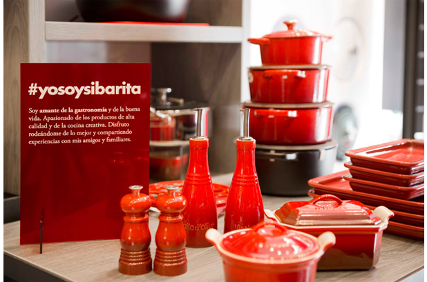
Nomon Design has developed a new strategy to Le Creuset, a leading brand in the Premium kitchenware market, which is expressed in the new communication concept "Kitchen with personality".
"With this project, our main objective has been to bring Le Creuset closer to its consumers in a more experimental and participatory way," they explain.
The new communication formats maintain the iconic colors of the brand (red, orange and black) but the fonts have been updated. Two fonts that coexist in harmony and that reflect character, tradition and quality, modernity and style and that enhance the new language of Le Creuset.

For headlines and hashtags they have chosen the Futura Lt Bold, dry and geometric, with rounded and friendly shapes. For the recipes, they have opted for a serif typeface, with elegant, traditional and timeless forms, which allows good readability of the text: Adobe Garamond Pro Regular and Adobe Garamond Pro Bold.
From now on, the new communication from Le Creuset will make consumers wonder what kind of cooks they are and will invite them to “tag themselves”: #soysibarita #soygourmet #soyfoddie. In this way they will discover which products say the most about them and which chefs represent them perfectly.


