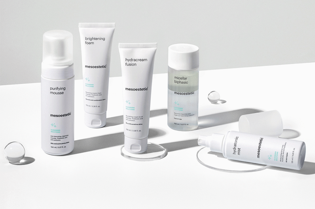
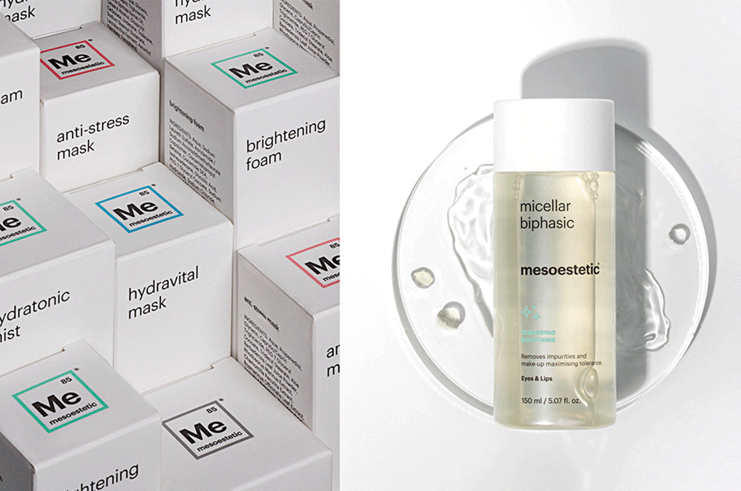
Morels has reviewed the portfolio architecture and redesigned the pack, improving navigation between the different categories to Mesoesthetic, a world reference brand in the aesthetic medical sector with a presence in more than 90 countries.
With the rest of "evolving to remain at the forefront", from Morels Brand Design solutions were provided in terms of: brand purpose and values, brand positioning, portfolio architecture, design, visual identity, brand narrative, naming and verbal identity, packaging design, communication. A clear example of the joint and coordinated work of a multidisciplinary team, a reflection of Morillas' strong belief in co-creation and the sum of effort between professionals.
Specifically, in packaging design, the primary objective was to bring clarity to the product portfolio. A portfolio architecture restructuring exercise was carried out to facilitate the understanding and differentiation of the different product families and ranges. Three differentiated lines focused on the medical channel, professional channel and home channel were created, creating a proposal for holistic and complementary treatments that was transferred to the pack design of each solution.
The medical line with the most advanced solutions was differentiated through a radical commitment to dark tones that contribute to the perception of quality and differentiation within the context of the category.
In this context, Mesoestetic's positioning strategy was redefined, finding a differential purpose, promise and personality that translated into an evolution of its identity, a redefinition of its communication language and a revision of the architecture of the portfolio and the design of product families.
