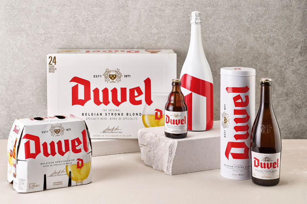
The evolution of packaging design for Belgian Duvel beer it was a process that took a long time to complete. Building on work first established through bottle and label designs, this iconic brand identity needed to breathe quality and modernity while strengthening key brand assets.
With a heavy focus on the brand's color DNA, deep red, clean white, and gold refinement, Four Mains he reduced identity to the essential. Strategic emphasis was placed on the iconic Duvel 'D', designed for unmistakable brand recognition. This powerful motif was also used to help differentiate Duvel's new products and bring that diversity but also strong unity to the design.

