La Ramón Bilbao winery requested Interbrand the development of a new brand strategy and the revitalization of its visual identity.
The explorer was chosen as the best archetype that could articulate this new stage of the brand. In this way, it also wanted to contribute to its international expansion process, by creating a graphic and conceptual universe based on the challenge of adventure and discovery. A brand idea, “The journey begins here”, has become Ramón Bilbao's corporate motto.
The logo so that it can better graphically synthesize the values of the brand and everything new that it should represent. The monogram evolves from the existing one using the acronyms "RB". The graphic elements are compacted with the help of a circumference, giving the whole character and tradition as if it were a heraldic seal.
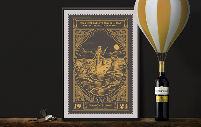
Illustrations In old engraving they represent different stages of a great fantastic journey that Ramón Bilbao made with hot air gadgets and other surprising means of transport, together with objects from the legacy of time chosen according to the type of wine. These illustrations are used at various points of contact such as packaging, digital communication, visual merchandising, advertising, events and promotions, which have consolidated the project of 360º rebranding.
On the bottles they appear in the form of a seal in the already characteristic double label of the wine brand. Still life photographs were taken showing the product in timeless scenes. A promotional poster of giant separable stamps tells us in stages the journey that the protagonist makes.

