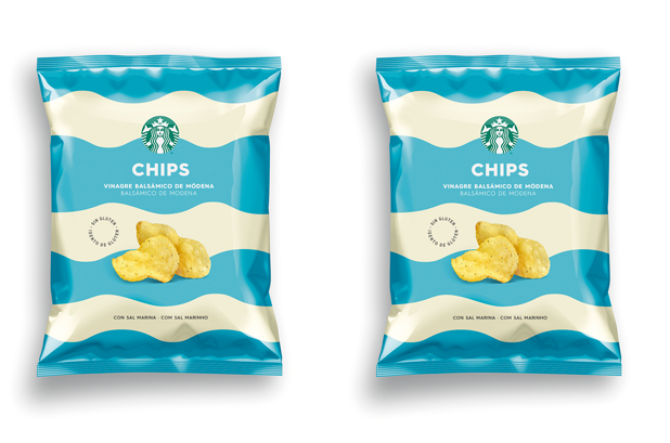
Starbucks launches, for the market in Spain and Portugal, a new range of snacks under its own brand. To meet this challenge, he was looking for a fresh and attractive design for his artisan fries that reflected the quality and values of Starbucks.
Big waves and marine-inspired stripes flood the the packaging to transmit the main attribute of the product, the sea salt with which the potatoes are made. Color is the tool that clarifies and differentiates the two flavors: green for potatoes with olive oil and blue for potatoes with pepper and balsamic oil from Modena.
Best Award 2018 Bronze. Pentawards 2018 Bronze. Anuaria Oro Award for Best Packaging.

