«A good packaging design allows the product to sell itself»
Meteorito is a graphic design studio in Valencia. When was it created and why?
Meteorito was born in 2013, led by its founder Eva Guadalupe in charge of creative direction and by Fede Reyna in charge of strategic and project management.
After our time at nationally and internationally recognized agencies, we are eagerly embarking on a new project in order to approach project management in a different way than what we have perceived throughout our years of experience. Our main objective was to focus on highly personalized customer service and taking into account the human factor, inside and outside the studio. Act with honesty and transparency at all times and always prioritize quality and customer satisfaction. We are aware that a high percentage of our orders come through recommendations.
We have been establishing our own work methodology, with our processes and our creative sessions internally or by participating with the client. We design with care and involvement even in production, we are obsessed with the finishes.
It could be said that, today, Meteorito is a design boutique instead of the usual agency.
Are they specialized in a specific area? What is the mission of the study?
We started covering many areas and developing very rewarding but also modest projects. With a natural evolution, we have been reducing our services to what really differentiates us and we have managed to position ourselves nationally as a studio specialized in packaging design, consulting and brand design. In addition, we have extensive experience in naming creation. Receiving national and international awards from the sector has helped us because they have given us recognition and confidence in working for larger brands.
We are characterized by our attraction to challenges, research, innovation and daring with new records in search of differentiation. Referring to our name, our mission is to make brands have a well-defined direction and objective and shine with their own light. Because only then will they be able to generate impact, leave their mark and be memorable. The same way a meteorite would do.
What sectors do they work for? Is it very different to create a project for food or pharmacy?
We work for very varied sectors but with a strong weight in food, whether gourmet, small or large consumption. For the beverage sector, such as wineries, soft drinks or liquors. We have also carried out many projects for conventional, natural or pharmaceutical cosmetics brands.
Actually, creating a project for food or pharmacy has many requirements in common but there are also clear differences. And if both cases are combined in a single order, the difficulty multiplies. I am talking about a product sold in a pharmacy that is consumed orally, since legal information and compliance with regulations is more complicated.
Among the common points are generic objectives such as linear differentiation and the correct hierarchy of information. But in the pharmaceutical world, packaging is a decisive space to describe the properties or instructions of the product. In this case, it is an essential requirement because the consumer will not be as familiar with the product, which is why it is very important that the information provided is very clear and effective. A strong determining factor is the level of demand on the part of a consumer who seeks and expects effectiveness and results; Therefore, with the design we have to open that door of trust and then the product will do the rest, obviously. This challenge of attracting and informing well is greater if we take into account that electronic sales are increasingly gaining weight (in products that can be purchased without a prescription), which will not have a prescriber to recommend them.
Another difference is the creative level. In food we have to go all out but in the pharmaceutical sector we must put certain limits on creativity. When designing we cannot forget that we are dealing with a laboratory product, with very specific and specific functions. Obviously, it does not mean that we stick to a totally white design, but we must act delicately, since the visual canons are more marked.
With the fierce competition that exists on the shelves, is it better to shock than convey the brand's philosophy? Or can the two things not be separated?
Both things must go hand in hand. We must always design taking into account the values and DNA of the brand because otherwise there would be no coherence and it could be confusing, generating possible distrust on the part of the consumer. The impact is very important in impulse buying, but let's not forget that a product will continue to sell if the brand is consistent with its principles and takes into account the quality and honesty of its products, since the market is full of brands that They will surely not fail and will be clear purchase alternatives.
In conclusion, having an impressive design is vital if you are looking for recognition and differentiation in a market saturated with supply, but always taking into account the brand's values.
Has the rise of online commerce changed the way we design? That is, is it essential to take into account that the product will also be sold online?
As I have already mentioned previously, in online sales the image becomes even more relevant. Other levels of decision come into play; In addition to the characteristics of the product, the level of visual seduction comes into play and, when faced with a purchasing decision between products with similar characteristics, the design will be decisive in choosing one or the other. Here, the emotional factor is also an important weapon to connect and establish a bond with the consumer through communication.
Something very important in electronic purchasing is "unboxing", the experience we offer when unpacking and opening the product, thus being able to create emotional ties with the consumer and strengthen it.
The use of color, typography and illustration are some of the designer's “weapons.” Are they all equally prioritized? Or does it depend on the brand and type of product?
It will be the set of all of them, their correct use and their harmony that will make a design effective and in line with the brand's philosophy. Obviously, the tone of communication, the audience to which it is directed and many other requirements or needs marked in the brief will be what will mark a direction towards one style or another, simpler or more ornate, a specific chromaticism or the decision to create a design with the most appropriate graphic resource, whether illustrated or unillustrated.
What characterizes a good packaging design?
A good packaging design is one that allows the product to sell itself. The one that, in addition to seducing, does not have to explain itself or does not need to be reinforced with communication. In itself, packaging is a very powerful medium for communicating and we must make the most of it.
A good design is one that, in addition to differentiation, provides the necessary information about the product for its immediate understanding. The purchase decision time on a shelf is very short, so the product that clearly defines what it is and what its virtues are will have a lot to gain.
A good design is one that, in addition to having a good finish and being well produced, offers a shopping experience. We are talking about having "storytelling" or telling a story that offers something. We are not talking about simply writing texts, but about involving the consumer by connecting emotionally.
A good packaging design is one that is designed taking into account factors such as profitability, savings or that reduces environmental impact.
If, in addition to everything mentioned, the design is aesthetically beautiful, you can't ask for more.
Can a bad design lead to product failure?
Yes of course. If the design is good and the product is of quality, it has a lot to gain in terms of sales success. If the design is good but the product features are not up to par, the design will help in impulse buying but the disappointed consumer will not buy it again. An important factor in the sale will be the established price, if it is not consistent with what the product offers, even if the design is very seductive, it will not be enough for many pockets.
A poorly formulated design that does not live up to the quality of the product or poorly executed in terms of functionality, use or the way of consuming it can seriously affect the volume of sales, negatively impacting customer perception.
We are surrounded by design, from street furniture to the clothes we wear. Do you think design is important to have quality of life?
The design is always formulated in order to respond to needs and offer practicality or usefulness. So, obviously, it is important to make our lives easier, more comfortable, more aesthetic and better in every way.
Do you take into account ecodesign criteria when starting a new project?
Yes, and it is a requirement that is gaining more and more weight given the direction of the market to be more sustainable and trends such as the circular economy to try to be more efficient, reduce environmental impact and the waste generated.
When we propose solutions for packaging, to the extent of the possibilities we have, we always take into account that it is as ecological as possible, looking for recyclable and recycled materials and proposing alternatives that are sustainable and efficient in their production process. We are interested in the challenge of reducing or simplifying production or the number of packaging necessary for the sale or distribution of products.
What importance do you attach to materials?
All. Because we are obsessed with finishes, we put a lot of emphasis on searching for quality papers and materials that transmit the values of the brand and the product. And offering more ecological alternatives, reducing the use of polluting materials.
The materials have to be consistent with the design because the final appearance will depend a lot on them.
Tell us about two of your projects.
One of our most recent projects, which is giving us a lot of joy, is Tomatier by Nijasol, an exclusive edition packaging of cherry tomatoes on the vine for Carrefour. A complete project that goes from the creation of the naming, brand design and packaging.
Our proposal was a box that would elevate the product to a premium category and differentiate itself on the shelf, highlighting quality values. It consists of a removable tray and a strip with a die-cut window to appreciate the product. The main attraction is a hand-drawn, engraving-style illustration of a branch of tomatoes that completes the shapes of the tomatoes shown through the window. A design with a craft or artisan style to highlight the natural character of the product and its completely manual harvesting process. The tray acts as a container in which the tomatoes are collected directly from the bush itself.
The environmental impact has been taken into account, dispensing with plastic or PVC trays and packaging.
Fortunately, it is a design that has far exceeded its sales expectations. And in view of the results, we are currently developing new formats or range extensions.
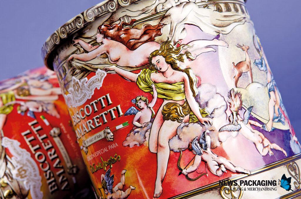
The packaging of Biscotti Amaretti is very different…
Yes, the packaging of Biscotti Amaretti, by Chiostro di Saronno for El Corte Inglés, is a totally different project and fresh out of the oven. A can of cookies made with almond paste by this Italian pastry company specialized in the production of sweets, panettone and liqueurs since 1847.
The assignment was to create a classic style design that was in line with the artisanal and traditional image of Chiostro di Saronno, which would convey the high quality of its product.
The hand-made illustration interprets, with a multitude of details and symbolism, several stories about our firmament, with personified stars and planets such as Mercury, Mars, Venus, the Moon, the Sun, the Aurora Borealis or the Rainbow. All of them protected by Jupiter and Juno, gods and kings of the universe and the heavens who appear in the stone frieze that surrounds the can at the top. As we rotate the can, we can see the color transition from dawn to dusk. The beginning of dawn represented by Aurora, goddess of dawn who flies with winged horses across the sky to announce the arrival of the Sun riding on her golden chariot. Passing through Mars, the god of war, and Venus, the goddess of love with the Morning Star, representing the beauty of the sunset along with her cherubs. Until we reach Luna, goddess of the hunt who, accompanied by her faithful deer, brings the starry night. And put an end to Mercury, the messenger of the gods who enters the deep night. The can is crowned by a lid that shows the constellations of the zodiac.
As for the finishes, there are ink reserves to reveal golden areas of the metal and a multitude of volumes in the typography, characters, friezes and cornices.
The result is a collectible can that, with touches of fantasy, tells mythological stories that bring magic to the moment of consumption, with the aim that the consumer keeps it in their homes for a second use.