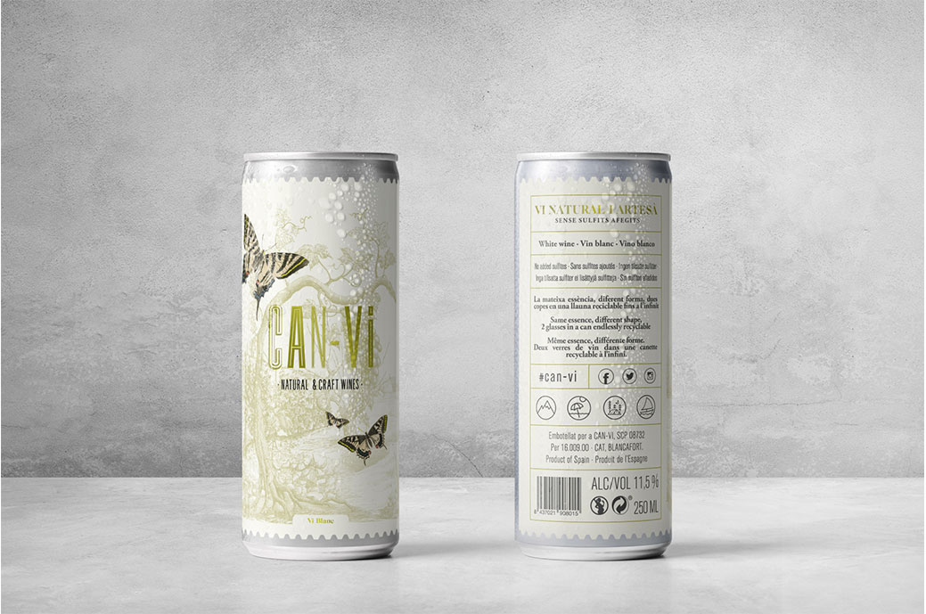
can-vi it's a brand of natural wines packed in year which aims to change the traditional concept of wine packaging. This new packaging has many benefits, but some users are resistant to this new format, so it is necessary to produce a «change» mentality.
For the packaging design of Can-Vi, Bulldog I wanted to create a brand that would have a feeling of quality and that would make wine accessible to all, thus bringing traditional audiences as well as neophytes closer together through the graphics of this product. The classic cut illustration is composed of a landscape in which some butterflies stand out, reinforcing the central concept of "change", a vital transformation that occurs in these insects when they go from chrysalis to butterfly.
The finishes that are reflected in the label they lead directly to a traditional wine label, transferring said "know-how" to the can, elevating its category with stampings and perforated edges on the die.
This label is designed in an enveloping manner. The back label moves away from a classic or standard construction, with a more modern and contemporary language focused on the product's public.

