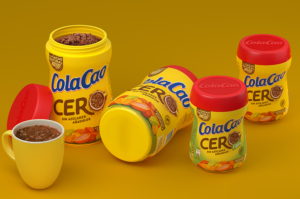
ColaCao, leader in the soluble cocoa category in Spain, decides to rDesign the packaging of its 0% added sugar version and they go to Little Buddha.
In a store where 0% is associated with diet and perceived as an artificial option to the detriment of flavor, the key was to strike a good balance between communicating the product's USP (“No added sugar”) while conveying the maximum flavor. On the other hand, it was important not to lose the link with current consumers, who are loyal to the brand and the product while opening doors to new potential customers.
With such a consolidated brand over the years and very established ColaCao's own DMS (logo, colors, lower illustration), the key area of action to be able to communicate the new positioning was the central Key Visual of "CERO". Taking this into account, it was decided to dispense with the numerical and percentage “0%”, with the aim of avoiding those graphic codes associated with diet and restriction of a product without added sugars. Instead, Little Buddha created a visual key with the word "ZERO", where they played with the iconic element of the cup, accompanied by the brand's characteristic lumps, and an explosion of flavor transmitted through cocoa powder. .
A design with a strong emphasis on the concept of "ZERO": this gains a lot of presence and becomes the protagonist of the pack, through a visual where the cup, the product and all its flavor are not only involved in the word itself, but also provide it with a lot of power and stand-out in linear.
On the other hand, the use of a very clear typography helps linear readability. The irregularity and thickness of the line, as well as its rounded angles, give it a human, organic and friendly character that is very much in line with the brand.

