"We seek to achieve effectiveness, within originality and innovation"
Enpedra Estudio is a design studio, specialized in packaging and label design for beverages, whose talent has just been recognized worldwide with the obtaining of a Pentawards Platinum.
What led you to be a designer?
Design is found in everything that surrounds us, the concern to express new concepts, to provide differential solutions to the products that are around us, explore new formulas, break barriers, managing to create meaning from simplicity, is something that represents my work. , which has motivated me to immerse myself in this profession and which drives me to continue working.
In what situation do you think design is in our country?
Talent, I think is the word that sums up the design situation, great professionals with brilliant jobs that demonstrate the effectiveness and good work of the sector.
When was Enpedra created and why?
Enpedra was created with the aim of guiding efforts towards the packaging sector, especially for the world of wine and spirits. We seek specialization, we immerse ourselves in this sector in order to understand it in depth and thus offer a quality service, in which we can advise our clients from the deep knowledge of each of the processes of creating a new packaging.
We seek, within originality and innovation, to achieve effectiveness.
Although you are specialized in packaging and labels for beverages, do you plan to design packaging for other sectors?
Creativity has no limits and we understand that, although we are oriented towards this sector, doing work for others is something that could arise organically.
What is the most important thing when designing a wine label?
Both the bottle and the capsule are also very important and can communicate many things with the label.
But, what is the most important thing when designing a wine brand? A name that is recognizable to a large majority, something not very far-fetched that can be easily remembered and a graphic that complements and reinforces it. It seems simple, even simple, but, in a crowded sector such as wine, visual cleaning with a high level of meaning, today, is something with enormous value to create a brand. Thousands of images and visual stimuli surround us; achieve a lot with little, connect with the target audience with concepts that have always been present and take them to express ourselves I see it as fundamental.
Creating disconnected presentations of the product that, despite their good presence, do not help the consumer to differentiate them from competitors, but rather merge with thousands of products, is something we should reflect on in order to improve when designing. to create brand.
What kind of materials do they use?
Most are papers; There are countless finishes and qualities today. Manufacturers are always providing new materials that allow us designers to have more with the textures of their papers.
How important is illustration and typography?
Many at two, each project has its characteristics, the illustrations that
we do are always unique, custom-made for each project, they are not a complement to the presentation but are the whole.
Depending on how the structure of the tag is built, this is how we must work with the elements; if the label is typographic, it will have a greater weight since there is no other element that competes in reading the label. If there are other elements, such as an illustration, we must know how to balance each one in the composition to create harmony.
Do you take into account different types of closure or bottle shapes?
Each element counts and we always work with a criterion in which both the bottle and capsules, corks and labels create a whole, we look for a simple connection.
Do you always work with the same suppliers?
Almost always, out of trust and good work.
The wine line has changed in recent years. Has it been possible to break with the classicism inherent in the most exclusive wines, such as the Gran Reserva, and follow more disruptive lines?
The great wineries are returning to the classic but renewed presentations with their first brands, although in other brands in their catalog they take risks and seek to reach other audiences with more innovative and disruptive presentations.
On the other hand, new wineries and projects are born that do not carry that barrier of history above and reach the market to provide new concepts and with them new original and differential presentations.
They just got a Pentawards Platinum.
What has this award meant?
Just being nominated was already a success. 2500 projects were submitted to the 2020 Pentawards Awards and we did it against large firms such as Absolut, Dewar's, Loewe and a long etc. of big brands. But getting the best award of all is almost a dream come true.
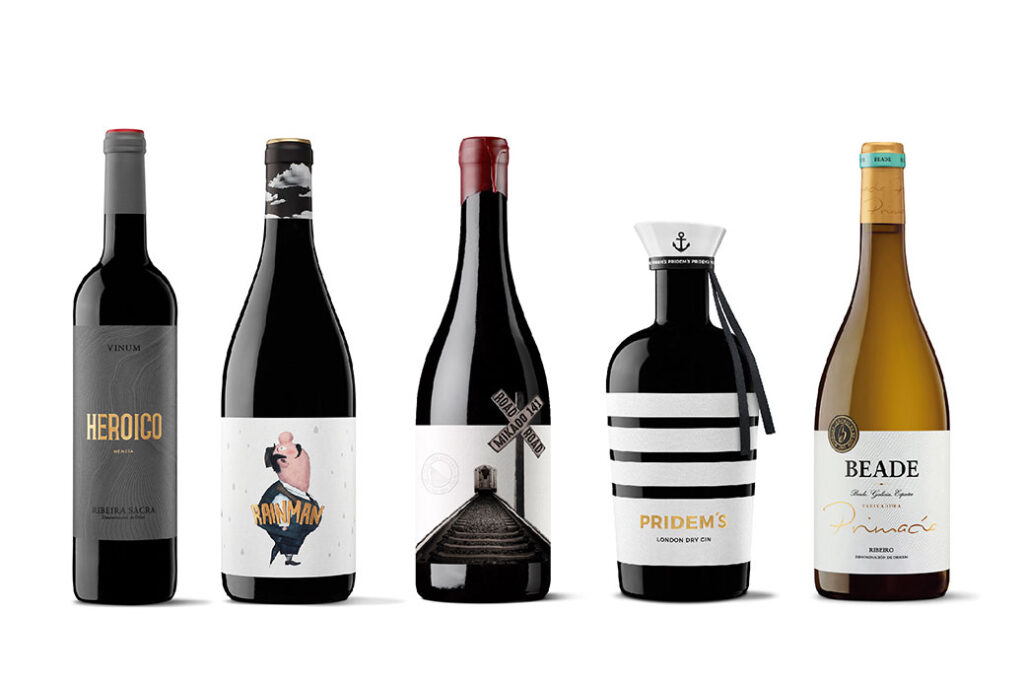
Tell us about the winning work.
The Pridem's Gin project begins with the design commission of a premium gin that aims to celebrate and represent freedom as an essential condition of the human being.
The customer was clear about the exact bottle model he wanted. This starting point was our first challenge, as it prevented us from designing our own crystal model, something very typical in the premium gin sector.
We face this first challenge by doing a study and analysis on the possibilities of offering a unique and differentiating design in the market. The cap and the label would be the protagonists of our history.
Representing freedom in its purest form would become our next challenge.
We decided that a sailor would be our concept to explore. In this figure we saw with clarity and satisfaction the perfect combination between the freedom of those who seek without fear and the security of those who take the helm and the direction of their life.
With the concept clear, our work focused on designing differentiating elements. The design and industrial development of the stopper that gives the product the personality of a unique element and the label formed by four parts without joints that make a complete packaging of the bottle. Both aspects of the project implied enormous complexity, since the bottle has a frustoconical format.
We achieve originality, from simplicity and timelessness, providing a differential value to the product.