«Every day there are more brands that give packaging the strategic value it has»
Supperstudio is a branding and contemporary solutions agency with a studio in Madrid. It is the only Spanish agency recognized by the Pentawards as Agency of the Year on two occasions (2021 and 2016) and is among the best agencies worldwide.
Supperstudio was born in 2003, it has been 20 years now…
Has the packaging sector changed a lot?
Without a doubt, throughout these 20 years we have witnessed the development of this discipline in Spain. When we started, we looked at other markets as references, the packaging of English distribution, for example, was at a level that we could not imagine here, but little by little we have been changing the situation. 20 years ago many hired agencies outside of Spain to be able to develop their work, today this situation has been reversed and it is international brands that are looking for our talent.
Every day more brands give packaging the strategic value it has and this discipline has been gaining weight. In a market that is constantly changing, in which new brands are constantly emerging, packaging is a fundamental tool with which to build a differentiating image capable of connecting with the public with a single glance.
They make “happy packaging”, fun, cheerful packaging… Did you see the world of packaging as “boring”? How would you define your philosophy?
When at Supperstudio we talk about Happy Packaging, we talk about building brands with their own style, with personality. Brands capable of telling stories that make you fall in love, that are not afraid to use humor to win the hearts of their consumers, that are committed brands, capable of going hand in hand with the real concerns of society, inclusive, respectful of the environment . Brands that surprise, that innovate, that go one step ahead, that connect with the consumer at first glance.
Happy Packaging is the best definition of our attitude when approaching each of our jobs.
Illustration plays an important role in his creations. Because?
Design work involves finding the best solution to respond to a need that the client has. Packaging is a discipline that combines a multitude of resources with which to design a concept and illustrations are a powerful resource.
For me, illustration is the perfect ally not only to communicate and build the personality of a brand, but it also allows us to innovate and give each project its own style. The infinite variety of these allows us to select in each case the one that best adapts to each concept. And we spare no effort when looking for new styles, trends and collaborating with illustrators, not only national but also international, with whom we can give that distinctive touch to our designs.
Is the use of color and typography decisive?
Of course. In packaging we always work with the same tools and color and typography are essential. Color is a brand asset. When choosing a color, we are already giving information to the consumer, this choice is never free. Through color we can reinforce the differentiation between flavors of a range on a shelf, if we think of an orange and lemon drink, surely a color instantly comes to mind for each one of us.
But beyond flavor, color also communicates intangible attributes of the brand, whether we are dealing with a premium brand or a first-price brand, entry into the category, for example. Color is an essential tool in packaging, just like fonts. With them we help give personality to the brand and build that identity that makes it unique.
The selection of fonts allows us to communicate brand attributes in a clear way to the consumer, for example, if it is a classic, modern or elegant brand; or if it is a brand that transfers trust, authenticity or it is a brand that connects with the territory of adventure, fantasy...
Typography always responds to a branding strategy and hence the importance of selecting it well. By choosing a serif or serif, or a more calligraphic or fantasy one, we are already communicating intrinsic values to the brand.
Do you apply ecodesign criteria in some of your proposals?
When designing we always try to take these types of criteria into account and, to the extent possible, we review materials, reduce the number of inks, etc. There are already many clients who assume that they have to change certain practices to be more sustainable and ecodesign is already present in many briefings. And when this is not the case, we are the ones who take the initiative and propose solutions that take into account the 3 Rs of ecodesign: reduce, reuse and recycle. We work closely with suppliers with FSC certifications, who reuse organic fibers or other waste materials, among others.
They have received many awards. What do the awards represent for Supperstudio?
The awards are recognition of our work, without a doubt. But above all, they support the trust that our clients place in Supperstudio every time they commission us with a project. Seeing our designs awarded, year after year, in the main national and international design competitions is, above all, a great responsibility for us. It forces us not to lower the level, to continue innovating and to strive to fulfill in each project the expectations that the client has placed in us. At Supperstudio we try to offer the best creative solutions, that is what moves us and with that objective we start each project.
Each of the awards we have received helps us to continue enjoying what we like most every day, doing branding and packaging design.
Do you think that the design created in Spain already has international recognition? Is there a "Spanish design" in the same way that we talk about "Scandinavian design", for example?
In recent years, Spanish design has been making a place for itself in design competitions. And today no one is surprised to find Spanish agencies among the winners of major awards like the Pentawards, for example. This is a result of the good work that we have been developing in recent years and the talent that exists in our country, but I do not think that in packaging we can talk about Spanish design in the same way that we talk about Scandinavian design. I think there is a way of working, a style that defines each agency, but I would not dare to generalize it.
Some of his clients are also disruptive, like chef Dabiz Muñoz, but others are much more classic, however, the approach is always original, "happy." Do you think you can adapt to any job?
We try to provide differential value in each job, always taking into account the briefing and needs of each client and project. And in some cases that "happy" approach is more evident than in others, but we always propose something disruptive with which our clients can stand out and find their own voice and personality with which to differentiate themselves from their competitors.
Tell us about two of your projects.
In line with innovation, eco-design and trying to take that step forward in each project, I would like to highlight a recent project that we have developed for Avery Dennison: Once upon a time. A project designed for companies in the 'Beauty' sector, which aims to inspire other brands with concepts based on innovation and commitment. Innovation in new uses, applications, techniques and finishes. Commitment to the environment, through the use of sustainable materials, and commitment to society, through the review of messages.
A selection of traditional stories, including Snow White, Cinderella, Beauty and the Beast, among others, served as inspiration for us to create 10 packaging concepts with which to rethink each of the messages that we have always been told with the objective of adapting them to the society of 2023.
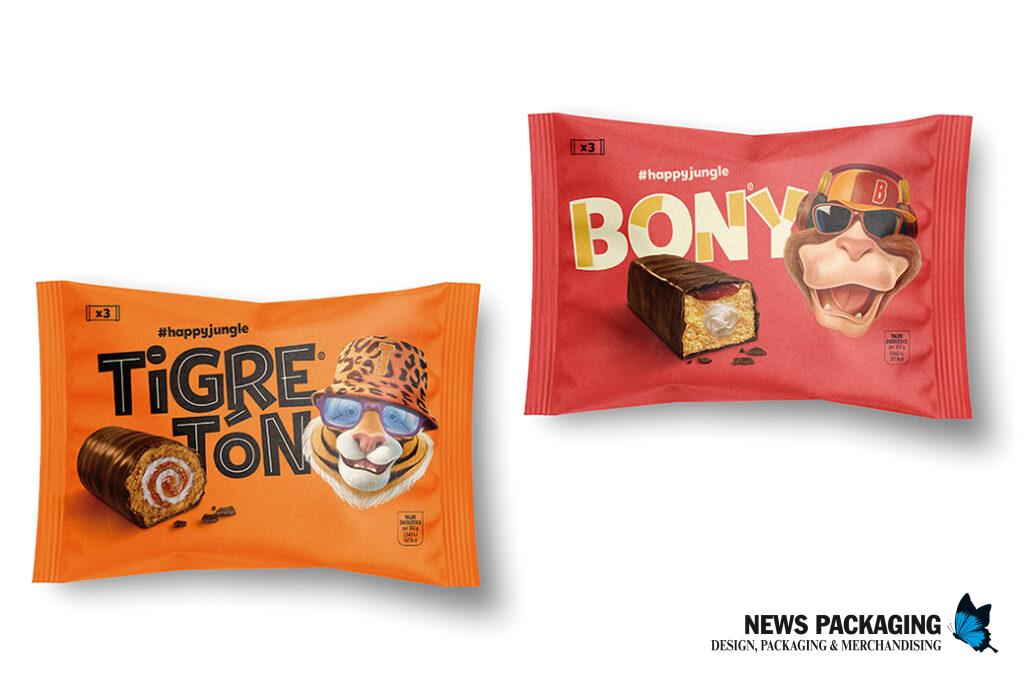
Another project that has seen the light not long ago is the rebranding and packaging of the cupcakes: Bony, Tigretón, Círculo Rojo and Pantera Rosa. We face the new visual identity focused on three axes: modernization, updating of the main characters and the search for a more natural and sensorial look&feel. A work that has been very well accepted in the market and has managed to reactivate the sales of all these brands and obtain the approval not only of those who were already consumers of these cupcakes, but also of new audiences.