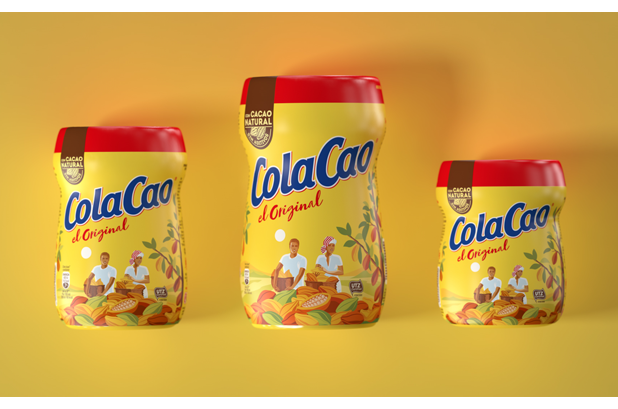
Battlegroup has updated the Branding de ColaCao to connect with the new generations that ask for more closeness and transparency. At the packaging they incorporate an immersive storytelling through the illustration, which tells us the history and origin of ColaCao.
Batllegroup proposed a cleaner and more natural image, where it is updated illustration, colors and fonts, evolving the iconic image of ColaCao to maintain full recognition. They sought to convey a simple and honest naturalness, without being overly promising. They do it through the cocoa tree, which transports us to the place and origin of the ingredient. This has been the concept that has served as the basis for the redesign of ColaCao's packaging, including in the illustration of the collectors.
They understand the illustration on the packaging as a vehicle to explain the history of ColaCao, which goes from the harvesting to the selection of cocoa, and which wraps the jar giving a 360 ° effect. On the back, the illustration connects with the explanation of the cocoa process, from its collection to the ColaCao in your glass of milk.
The sun, which in the previous design took on a lot of prominence and served as an element to hold the logo, is now simplified and integrated into the landscape, transporting us to the time of harvest, dawn.
The warm colors are true to the previous design, although slightly desaturated. Especially the background yellow, which has been softened to bring naturalness to the design.
