Delamata redesigns the branding and packaging of La Cocinera

26th September 2023

The Cook

For Delamata, the challenge of the project was to redesign the frozen range from La Cocinera without losing the brand values: product quality, tradition, know-how and recipes prepared “like at home”. The objective was to reach a younger audience, who does not have time to cook, but who likes quality traditional food and also not lose the recognition of the brand for its usual audience.

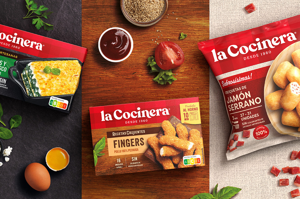
They modernized the visual identity, giving it a friendlier and less industrial touch. They reaffirmed the history and know-how of the brand by introducing the founding date “since 1960” in the brand block. We also modernized an icon of the brand, which is its checkered tablecloth, giving it more prominence and doubling its presence and visibility on the shelves, making the brand more coherent and homogeneous.

For the pack, they organized the entire range, clearly differentiating the families, playing with textures and creating scenes with a great presence of quality ingredients, recreating environments that lead to preparation like at home. They ordered the messages to be highlighted using only the most relevant ones that add value. They used color codes to differentiate between varieties and used textured backgrounds to differentiate between ranges, slate for the artisans, wood for the crunchy ones, burlap for the delicious ones...

To extend the range of the new Bakeable croquettes, we highlight the oven tray, being consistent with the rest of the range in which the preparation method is very visible.

You may be interested in continuing reading ...

A vermouth with sensory packaging

Pep Bernat Vizcaya and Ainhoa ​​Nicolau Salas designed the container for Turmeon vermouth (Bodegas Jaime). The vintage color system, combined with an intricate typographic pairing, creates a design...

Little Buddha redesigns the Natursoy range

Natursoy is a Nutrition & Santé brand, a pioneer in the Spanish market for organic and plant-based foods. He decided to redesign the entire range, to adapt to the new trends ...

Award-winning edition of Ramón do Casar wine by Roberto Núñez Studio

The new positioning of the brand, the restyling of its identity and its new limited edition packaging, the work of the Barcelona agency Roberto Núñez Studio, have managed to convey the story...

No Man's Space Eclipse Gin label by Spazio di Paolo, awarded with the Arconvert Label Award

No Man's Space Eclipse Gin by Spazio di Paolo is the winner of the Arconvert Label Award, one of the three special awards of the Dieline Awards assigned by Arconvert, official partner of these awards ...

Azote Estudio designs the packaging for Blanco de Parcela

«Blanco de Parcela, Fuente de las Hontanillas 2019» is the first and exclusive white wine from Bodegas Aalto, after 20 years of history. Given the exclusive nature of the product, Azote wanted to work a ...

MW creates a custom board game for Stranger & Stranger

This custom board game made by MW Luxury Packaging was a Christmas gift from the design agency Stranger & Stranger. Inspired by Game of Thrones, "The Game of Stranger" is a ...
Translate »