El ANUARIA award, with a history of 30 editions, has established itself as the national reference graphic design award in Spain, to which the main design studios, designers and agencies from all over the country present their best works. It is a standard of excellence certified by the Veredictas International Foundation, which dedicates its work to promoting design excellence in more than 20 countries in America and Europe.
The ANUARIA jury is made up exclusively of members designated by official organizations. The jury has awarded 22 ANUARIA DE ORO awards to the best works.
The 16 works recognized with ANUARIA GOLD Award
1. ANUARIA Award for the best advertisement published in the press
25 vintages - by Lles for Bodegas Familiares de Rioja in La Rioja
The traditional presentation of the wine vintage of the Association of Family Wineries of Rioja celebrated its 25th edition. The model with the jug in his hand, who in real life is a Riojan fashion designer, represents the spirit of the Association, respectful of tradition, but at the same time innovative and avant-garde. The chosen neo-Gothic typography fits perfectly with the aesthetics of the model.
2. ANUARIA Award for the best commercial advertising campaign
Kolapse: Choosing Tomorrow- by Gu Design /LLYC for BBK foundation in Bilbao
According to the UN, in two years the planet will reach the point of no return. Irresponsible consumption, unsustainable policies or short-term decisions cause us to consume twice the available resources, bringing us closer to collapse. To encourage reflection, an installation was created that makes tangible the pressure that our decisions cause in society. An interactive work, which in real time showed the consequences of decisions, swelling or deflating. The work only lasted 73 hours. until it collapses, sending a clear message: it is now or never. We still have time to avoid the true collapse of the planet. A dynamic visual identity was created that changed to black at the time of the collapse. The work was created by the internationally renowned urban artist, Spy.
3. ANUARIA Award for the best social interest campaign
'It's not going to do anything to me' – by Estudio Paparajote for Cartagena City Council in Cartagena (Region of Murcia)
'He's not going to do anything to me' is the title of the 25N Campaign, International Day for the Elimination of Violence against Women, carried out for the Cartagena City Council. Raquel told her sister: “He's not going to do anything to me,” a few days before being murdered by her ex-partner. So far this year, 52 women have lost their lives at the hands of their partners or ex-partners in Spain. More than 30% of women do not report because they do not consider the violence they suffer “serious enough.” This distorted perception of risk is a shared responsibility of the entire society. The campaign materializes in a black silhouette that, like a monolith, pays tribute to these women, and encourages them to put themselves in the hands of specialists who accompany women in their process.
4. ANUARIA Award for the best poster
Jazz San Javier – by Casau Estudio for San Javier Jazz Festival in the Region of Murcia
Poster to commemorate the 25th Anniversary of the San Javier Jazz Festival where the protagonists are the musicians, illustration and typography. The illustration adopts the colors of the spotlights and the scenery of a Jazz show. The font chosen is Stinger, a very striking type, full of twists and sinuous shapes (like the sounds of jazz) with great contrasts between thick verticals and thin horizontals that makes it perfect for large and eye-catching headlines.
5. ANUARIA Award for the best brochure, postcard, flyer, etc.
Didactic communication polyptych – by Mimografico: Design Studio for Arahal City Council in Seville
Polyptych focused on the visit of schoolchildren to the Interpretation Center for Women in Flamenco Arahal – CIMFLA (Seville), published in December 2022 and in use throughout 2023. The assignment was to create a material that would serve to communicate the schedules of opening and attention to the public of this spectacular museum, while at the same time it could be used as a learning object for a children's audience. We managed to execute on the same paper (size 30x30cm), a diptych that inside contains eleven games related to the history of women in the world of flamenco, with a special nod to Pastora Pavón. Designed so that it can be transformed into the popular coconut, through a simple origami exercise.
6. ANUARIA Award for the best catalog
Charter of Values – by Estudio Linea for Euskadi Gastronomika in Euskadi
Euskadi Gastronomika, the network promoted by the Basque Government that guarantees the excellence of gastronomic tourism in Euskadi, redefines its values. In this new stage, the visual identity and graphic language are redesigned, which has its maximum representation in this catalogue, the Charter of Values. The new symbol of Euskadi Gastronomika, which suggests everything from the rings of a tree to the shapes drawn by sauces on a plate, is the protagonist of the cover. A succession of dies invites us to discover the different values of this new philosophy, each one represented by an illustration that in turn interacts with the dies themselves. A journey through different layers that take us to the origin of Basque gastronomic tourism.
7. ANUARIA Award for the best design of a self-promotion piece
Work in progress 2023 – by Worköholics Spain for Worköholics in Bilbao
Initiative promoted by Worköholics with the collaboration of Vans, which celebrated its second edition last June. An event open to participation through a phase of receiving applications, which aims to discover and disseminate the talent of creators from disciplines such as visual creativity, design, photography and video, illustration, motion graphics, or the creation of digital content. The event takes the form of a day-marathon in which each of the 12 selected creative people has 12 minutes to show their work, processes, references, etc. The graphic concept of the latest edition presents the satellite as a locator for emerging talent orbiting in the digital universe.
9. ANUARIA Award for the best design of a periodical publication (magazine, newspaper, etc.)
Zaragoza Joven Magazine – by Detalier creative studio for Zaragoza City Council
The Zaragoza Joven department launches a new quarterly publication, in which each issue will revolve around a specific topic. The design takes into account the target audience at all times. The aim is to create different covers, with added value that attract the attention of young people and invite them to pick up the magazine and read it. Inside, the layout follows the same graphic line of the brand, with articles and illustrations made by young people from Zaragoza.
10. ANUARIA Award for the best design of an editorial publication.
Markus Linnenbrink. Flamigloveanddestiny by Dardo España for Fundación DIDAC in Santiago de Compostela
Flamingloveanddestiny collects the site-specific interventions carried out by Markus Linnenbrink in different places around the world and is titled after his work at the DIDAC Foundation, which publishes the book. The German artist occupied the entire space of the Foundation to turn it into a habitable painting of enormous dimensions and on the occasion of the exhibition a volume was published that tries to reflect his process. The interior is divided into two blocks: the first on rough offset paper collects a conversation between the artist and the curator with documentary images of the development, in black and white or monotone fluorine green, while the second part of the book gives all the prominence to the work with large full-bleed photos on coated paper to faithfully reproduce the colors.
11. ANUARIA Award for the best book cover.
Markus Linnenbrink. Flamigloveanddestiny- by Dardo España for Fundación DIDAC
The book Flamigloveanddestiny brings together the pictorial installations made by the German artist Markus Linnenbrink in different places around the world. His paintings invade the architectural space with large stripes of color that distort perspective. To represent this work without showing it directly, we resorted to the use of bright and saturated colors that are part of the artist's usual range and a composition that refers directly to his work: the text in capital letters is arranged in four solid color lists, whose inclination It tries to transfer to the book itself the feeling of imbalance that is experienced when entering the facilities. The binding is hardcover with fluorescent pink stamping on bright green fabric and orange endpapers.
12. ANUARIA Award for the best report or balance
Activity Report 2022 R4 Banco by Mr Gutenberg for Renta4 Banco in Spain
Design and graphic conception of the Annual Report of Renta 4 Banco as a piece of corporate communication where what happened in the company is recorded. Inspired by the brand's new image, it seeks to respond to the bank's dual axis of communication: digitalization and proximity in equal parts. A horizontal reading approach is made to evolve and give it personality, helping to ensure an agile and close reading. With this dynamic, contemporary and graphic-oriented proposal where the visual and photographic support finishes giving cohesion to the piece, we seek to reflect Renta 4's commitment to sustainability and to customers.
13. ANUARIA Award for the best illustration
Jazz San Javier by Casau Estudio
Series of illustrations to commemorate the 25th Anniversary of the San Javier Jazz Festival. Illustrations with powerful strokes and great contrasts to provide a lot of movement. We use the colors that emanate from the spotlights and the scenery of a Jazz show. The stars of the poster are the musicians themselves, since they are the true architects of making us vibrate.
15. ANUARIA Award for the best typography
Typeface Altar by Alucina. for Finausa in Barcelona
The Altar typography was born from the need for a space to acquire its own personality. Inspired by the letters sculpted on a marble altar in a room in the space, Altar has been designed to be the main typography of the identity. It is a hybrid typeface that has two styles. Capital letters and small caps in a single weight, with subtle and delicate serifs that refer to the incisions of the letters engraved on stone. A classic Roman with a more elegant touch. Its stylized appearance with condensed proportions offers a play of shapes that is characterized by its high contrast, the font also opens a wide range of alternatives, ligatures and punctuation marks that reinforce its elegance. A visual system that goes beyond a simple identity.
16. ANUARIA Award for the best logo for a product or service
Red Prawn from Almería by Humad for ASOPESCA in Almería
The queen of the Mediterranean. Finally, a product as wonderful as the Almería Red Prawn has its own brand. A seal that goes beyond a commercial issue as it guarantees the fishing area, the selection process and the commitment to the environment in the Alboran Sea. An ad hoc design that reminds us of the heraldry of family coats of arms. These shapes automatically transmit history and personality to us, since the brand is new but the product is ancient. In addition to its institutional character, the Gamba Roja de Almería logo is loaded with nuances and details in its composition. Inside we can find the sun, the sea and the land; even the wind that reminds us of the towers of the Alcazaba and at the same time a crown, that of the queen of the Mediterranean: the red shrimp.
17. ANUARIA Award for the best naming of a product or service
Linatura by Clara Xarrié Studio for Linatura
Linatura is a home textile product brand, whose differential values are its fabrics made of 100% linen and its natural style, as well as environmental awareness, local production, authenticity and quality of its products. We play with the semantics and sound of words like Lino, Natura, Hilatura (as an essential part of textile production) and with the suffix -tura, which linguistically converts the verb into action and/or effect. Linatura is, therefore, making, feeling and experiencing linen from an authentically natural style.
18. ANUARIA Award for the best corporate identity program
Hijos de Rivera Corporate Identity by Atrevia Comunicacion, SLU for Yarza Twins in Madrid
Hijos de Rivera, with 117 years of history, needed its own corporate identity. To design it, he relies on Yarza Twins. The sisters found a seed shape in the tile mural of Estrella Galicia's original boiler room. That symbol hidden in the R represents the origin of the company in two senses: the raw materials from which its products are born and the seed planted by JM Rivera in 1906, the family origin. Next to it, a tilted H represents 5 descendant generations that embrace that R and its legacy, transforming a local Galician company into a global brand without losing its values. They also develop their own and international “language” for their “speakers” (stakeholders) structured through iconography, reminiscent of references.
19. ANUARIA Award for the best packaging
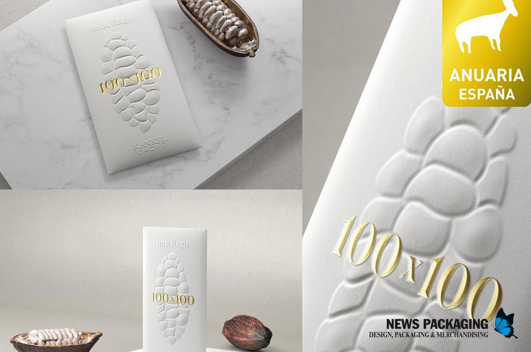
Mucilage, the purity of cocoa by TSMGO – The show must go on
The challenge for Kankel Cacao was to obtain a pure bean-to-bar cocoa bar, which was entirely composed of cocoa from the cottony white pulp that covers the cocoa seeds: The mucilage. A food that is increasingly valued by prestigious chefs and whose acidic flavor provokes intense and passionate taste reactions. For us, the consumer understood what we were proposing at a first glance: We found the solution by abstracting and synthesizing every accessory element, pointing to the essence and rawness of the cocoa pod itself. It is unusual to see mucilage in this way, so we place it in the foreground as the absolute protagonist of the packaging. Self explanatory, it is understood without the need for any speech.
20. ANUARIA Award for the best website
Pin by Microbio Communication for Pin by International
Pinea is a winery that produces signature wines in the heart of Ribera del Duero, with a characteristic approach based on respect for the land and the product. We design and develop a custom website to reflect your values. Thanks to an approach where transitions, navigation and typography are the protagonists, a modern and visual technological solution has been developed, which captures the essence and objectives of the winery. A website to tell what they are. To project what they want to be.
21. ANUARIA Award for the best design of an application, APP
ZEID Fest App by Worköholics for Guuk in Bilbao
We created the ZEID music festival app, promoted by the operator Guuk in its purpose to connect people with their passions. A digital product that seeks to contribute to the construction of a more active, participatory and cohesive citizenship. The “Zeinen Ederra Izango Den” application offers an experience that transcends the musical show itself. In addition to increasing the level of participation in the festival (more than 400 people participated in merchandise raffles during the festival through the app), it functions as the most important information channel during the event.
22. ANUARIA Award for the best advertising campaign in digital media
Next Generation. It's your moment by Mutta Spain study for the Government of Cantabria in Cantabria
The Next Generation funds are to promote people's projects and therefore, the economy of Cantabria. The campaign seeks to convey progress, development, future. The characters always appear in motion, because what we do now will have an impact on our future. All the elements that appear in the graphics rotate forward, the arrow moves forward, the character rotates on the circle, etc. A sensation of progress and movement that can be transmitted even in static images. Both these graphic elements and the slogan function as an axis or mark of a specific moment that must be taken advantage of. It's time, it's your time.
23. ANUARIA-Pro Award for the best work or study project carried out by a final year design student. (Reduced registration)
'Puntada i Creuada' by Àngels Villegas
'Puntada i Creuada' wants to adapt cross stitch to the current context, the embroidery technique that my grandmother has passed on to me since I was little, with the aim of revaluing it and ending the generational gap that makes its transmission to younger generations difficult. . Therefore, we seek to preserve cross stitch through typography, developing a reticular digital letter based on its stitches. The letter can be adapted to be physically embroidered while allowing unique patterns to be created, encouraging recipients to begin the technique. Both fonts promote intergenerational interaction with cards and graphic products that facilitate teaching and dialogue between generations, thus preserving this valuable artisan tradition.
24. ANUARIA Prize in the Miscellany: All works that their author considers may not be included in the other categories.
Diex Design Fest by user.studio
On the occasion of the General Assembly of READ, the Association of Designers of Extremadura celebrates its 20th anniversary with a design festival over a whole weekend. So far this millennium, globalization is being rejected as the prevailing narrative. The cultures of each region are re-emerging in a resignified way, in a syncretism between the pagan revival and the prevailing global culture in decomposition. This graphic is born from there, from the mix between global graphic codes and the recovery of traditions from the north of Extremadura. In this case, the Jarramplas del Piornal, the Enramá de Pinofranqueado and the drums from all over the north of the region. Resignify tradition, make it ours and project our own future in a non-global.

