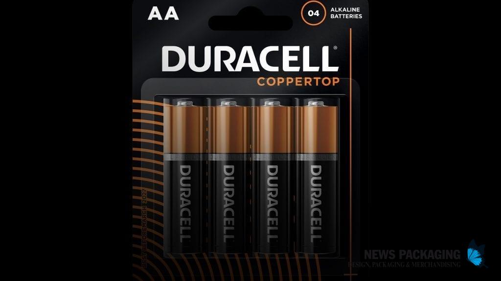
SmashBrand decided to build the concept of Duracell packaging around its iconic copper lid. In this way, she used the black and copper color combination, instantly recognizable as Duracell's identification.
In addition to the black and copper design, they added different colors for each product line, making it easier for consumers to choose the right battery. They included visual cues to make the consumer think about what is inside the battery and the quality of Duracell
Duracell needed high levels of brand recall, so the design focused on reinforcing trust with its iconic black and copper colors and creating visual cues to attract attention and visual disruption through distinctive assets.
Photos: SmashBrand.